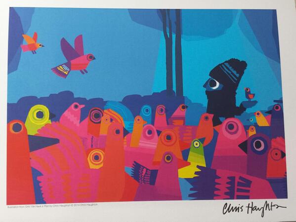
Picture book lovers stand by, design aficionados stay tuned. This month we have the book that we know you have all been waiting for...the BRAND NEW picture book from one of the most exciting voices in children's literature, Chris Haughton. There was a stunning GREEN cover for A Bit Lost, an eye-catching ORANGE for Oh No, George! and now you can add a vibrant BLUE book to your Chris Haughton collection! Here Chris tells us all about the making of his latest book, Shh! We Have a Plan
One of the things I have been trying with my books is to tell stories as
much as possible through images rather than through words. If the story
can be read without language, it should have the ability to be
understood by the very young. I would like to think all my books are
told in a way that someone without language could understand but I think
the story in this book could be the most visual of the three, it
certainly has the least text. In fact, the total word count is only 103,
and ten of those words are ‘shh!’ which I am not sure is a word but I
counted it anyway, I even counted the five words of the title which is a
trick i picked up at school. It is a bit embarrassing then, that it
took more than 2 years to write. I worked out on average I wrote one
word every six days. Not exactly the writing speed most writers aim for…
anyhow…
I started sketching out ideas for this book thinking there must be
some way of making a ‘chase/catch’ type book. It brought me around to
thinking of the Road Runner cartoons where there there are elaborate
plans which could all work very well visually. Quite suddenly three goon
type characters trying to trap a bird popped into my head, that it
would be great if there were three, each with a different plan. What I
liked the best was there could be a drawn out pantomime effect, similar
to A Bit Lost and Oh No, George!, with an anticipatory page turn between
‘ready/steady’ where the three position themselves to catch the bird and
GO! ..where of course they miss.
Finding the ending was easy as I had sort of come up with it in the
beginning (!) the really tricky part was fitting the ending into the
story. I originally had three other ‘good’ characters who were feeding
the birds instead but it seemed very abrupt to introduce them midway. It
seemed best to have a character with the answer the whole way through. The
book seemed a little clunky and wordy when mocked up with four/five
characters on every page, so together with my art director, Deirdre, we
hit on the idea of a conversation happening across a page. There was
lots of comic potential with this, I really loved working on it. If you
think of books like Martin Waddel’s ‘Owl Babies’ it makes use of a
repeated conversation across the page, each character repeats the same
thing, over and over again. It is predictable but also has a pantomime
effect and great for doing silly voices. We had so many great lines we
had to work on editing it down and in fact I think there is enough
material for another picture book in there if we are lucky.
For my other two books, i am always asked if I used paper cut, as
they look quite like it, but in fact I did not use paper cut at all when
creating the artwork and it was all pencil and digital. For this one
though because it had five characters on each page it needed some sort
of drastic simplification for it to be read clearly. Not only that but I
was keen for the conversations to read across the page, matching each
line with the action of the character. There was so much shifting of
compositions around on the pages that it became clear the best way to
compose each page was by collage. In fact it made perfect sense to
create a mainly silhouette image from paper cut and in fact the design
of the birds also benefitted from it too.
For the final artwork I was keen that that the bird seems somehow from
another world, brightly coloured and abstracted and removed from the
world of the characters, it focuses all our attention on the relatively
tiny bird on the page, leads the reader through the pages of the book
and gives a punch of colour at the end. My other books are very
colourful so it was quite satisfying to try to work almost entirely in
silhouette for this one. In fact there was a lot of really interesting
experiments with the colour. Usually full colour printing is in CMYK,
but the whole of the book is printed in only CMK (blue, magenta, black)
and the only yellow that appears in the book at all is in the colour of
the birds. It was our hope that with this approach the bird would stand
out completely from the rest of the book.
I am hugely indebted to my art director and editors, Deirdre McDermott and David Lloyd at Walker books for
all their feedback and help on this book. It improved immeasurably with
their help and I consider myself very lucky to be working with them.
Available in English, French, Spanish, Catalan, German, Danish,
Dutch and Norwegian from Feb/March 2014. More details
coming soon.


